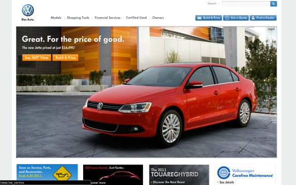
I like presentations, and stylistic analysis of what is being represented. I find it interesting to check out of some of the german companies to see how their website front pages compare. Yes you mind find this a bit insignificant, and without any real substance——BUT i feel it does have substance. I feel it shows the philosophies of these companies….and to whom they are catering to.
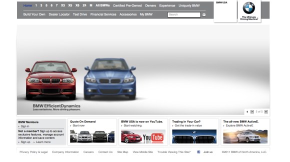
BMW: A cluttered, and slightly primitive looking site—-doesn’t really look like it is fitting in with the brand image.
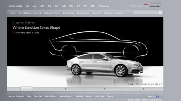
AUDI: The most minimalist website out of all the 4 brands I looked at. No added frames or unnecessary features. I like the focused energy going on here—with the nice grey background.
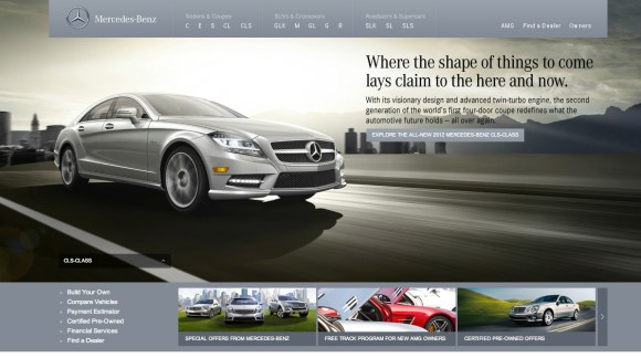
MERCEDES-BENZ: a nice website with a photo-heavy base with border navigation on the top margin. Same type of grey shades as Audi uses; however used quite differently. The most ‘movement’ is seen on the MB site, as well as the smallest lettering.
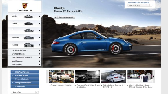
PORSCHE: Much better than the BMW site, but still a bit dissappointing. The ‘small’ icon photos of each car on the left navigator bar is quite annoying, imo.
VW: simple and uncomplicated with a clear goal of shoving its new Jetta into sales-heaven…..

